In October 2024, Dream11 moved into casual real-money gaming. Not a standalone arcade: a cheaper way into the Dream Sports ecosystem, and something to play between cricket seasons.

Casual Gaming App
DreamPlay
Dream11's casual real-money gaming platform, a lower-cost way to bring in new players. Two games shipped, a crore of daily CEA, ~20% better Week-4 retention than industry norm.
DreamPlay Lite A ten minute walk through the project.
~20%
better Week-4 retention than industry norm
₹1.25Cr+
daily CEA, held for weeks with no marketing
2
games shipped, Carrom and Ludo
9 mo
from kickoff to steady growth
Detail has been reduced here to honour the NDA and confidentiality agreement.
The Opportunity
A low-cost way into the Dream Sports ecosystem.
Why it made sense
- Cheaper acquisition: A fraction of the cost of fantasy sports, feeding the wider ecosystem.
- Revenue between seasons: Cricket is seasonal; casual games are not.
- One account: Shared Dream11 wallet and KYC, so no second sign-up.
The ask
- A modular app carrying in-house and third-party games.
- One shared wallet, inside the Dream11 ecosystem.
- Built to scale, from small studios to AI-made games.
- Short sessions, with quick payouts.
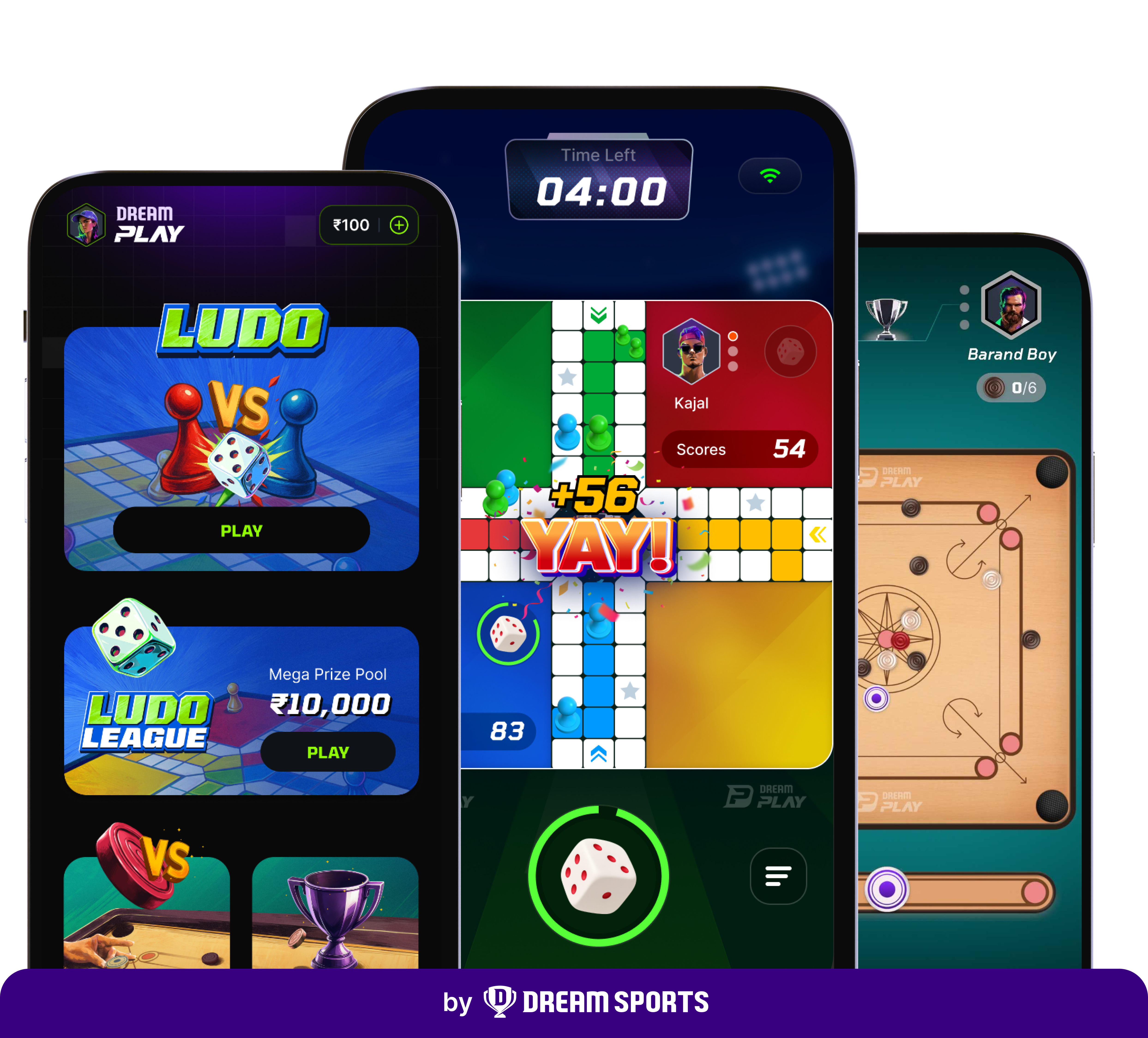
Dream11's Foray into Casual Gaming
The brief
Design for diverse profiles: gender, demographics, region.
Two to ten minute games, with quick payouts.
Keep game supply and error handling running 24x7.
Catch fraud in the backend, not the front end.
Challenges and Principles
The problems we had to solve.
Real-money casual gaming is genuinely hard to get right, most platforms struggle with the same install, trust and fairness problems. The plan leaned on an existing brand and user base.
Core challenges
App size vs. many games
Large downloads lose Indian users mid-install.
Acquisition and KYC drop-off
Sign-up and KYC is the costliest, highest-drop-off step.
Scaling the platform
Growth, including third-party studios, must not bloat the app.
Cheating and fraud
Real money invites faked results.
Matchmaking takes time
Real opponents take a moment to find; empty waits lose players.
Patchy networks
A drop mid-join can strand a player with money in play.
Trust when things break
A stall or doubtful payout breaks trust in seconds.
Principles
Relatable
Familiar game elements: tickets, stamps, everyday cues.
Exciting
Bright colour, bold type, constant motion.
Trustworthy
Clear stakes, honest states, reliable payouts.
Engaging
Depth in the features and the way you play.
Competitive
Built through interface, imagery and words.
Scalable
A modular build, ready for new games.
Design approach
UX strategy
- Checks built into the path to a game, not a gate before it
- One shell, games added as modules
- Navigation that scales as the library grows
- Waits and failures designed, not patched later
Colours and type
- Palette and type scale built from scratch
- High contrast, AA readable
- One system across the shell and games
Illustration style
- Custom artwork for the key moments
- A consistent character and prop style
- Assets built ready for motion
Game identity
- Each game gets its own look inside one shell
- Modular branding for partner studios
- Scales to every new game added
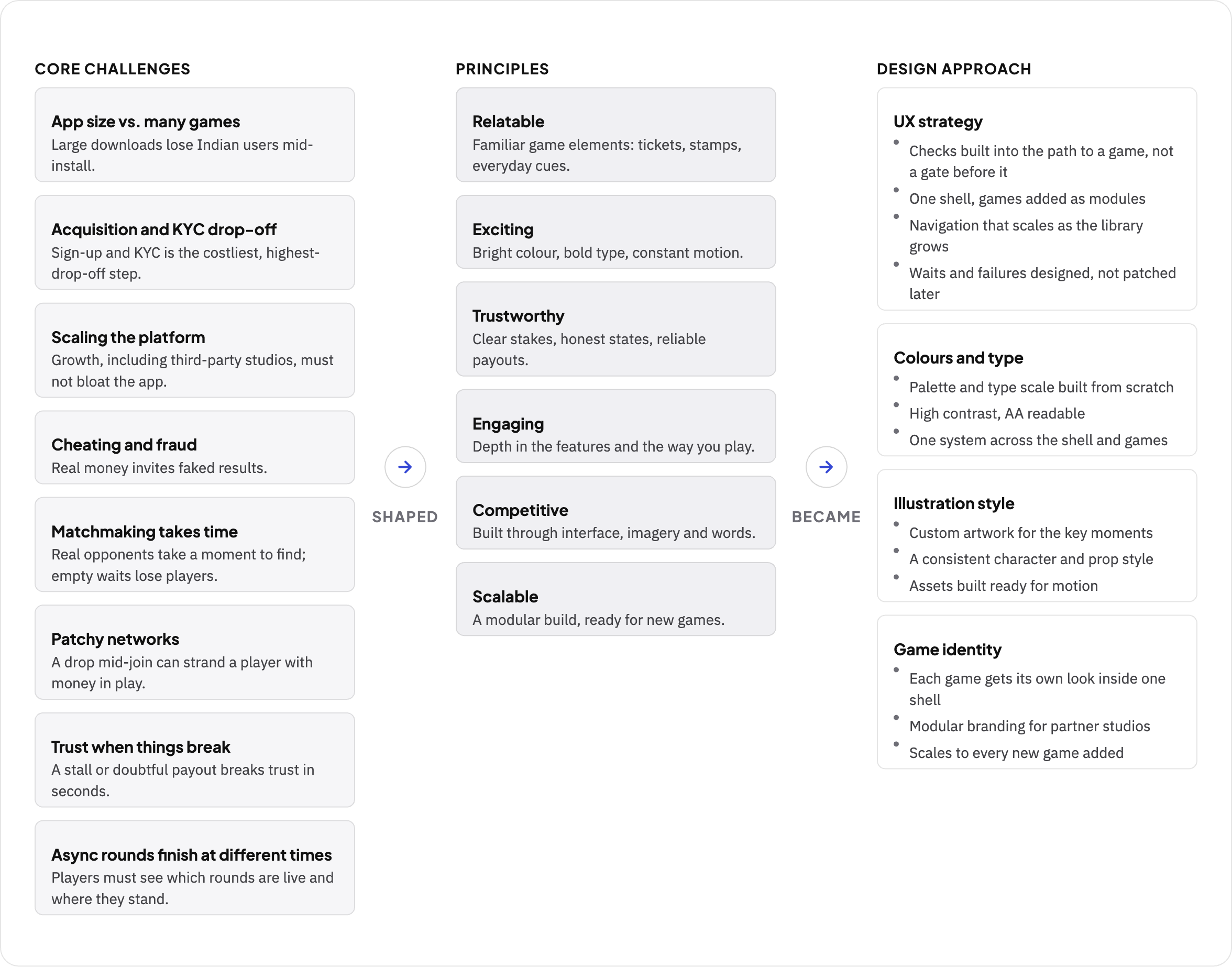
From the core challenges to the principles to the design approach.
So how did the platform take shape, and how were those challenges addressed?
Laying the Foundation
One flow, from sign-up to first game.
The platform ran on Dream11's systems: account linking, shared wallet, verified KYC and profile carried across. The design job was to simplify all of it into one path, from sign-up to finding and playing a game.
Integrated with Dream11
Account linking carried KYC, wallet and profile across. No second sign-up, and lower acquisition cost.
One step at a time
Low balance, consent, first download: each one appeared in place, with a next step.
Straight into a game
The home showed the biggest contests first, so the next tap was into a game.
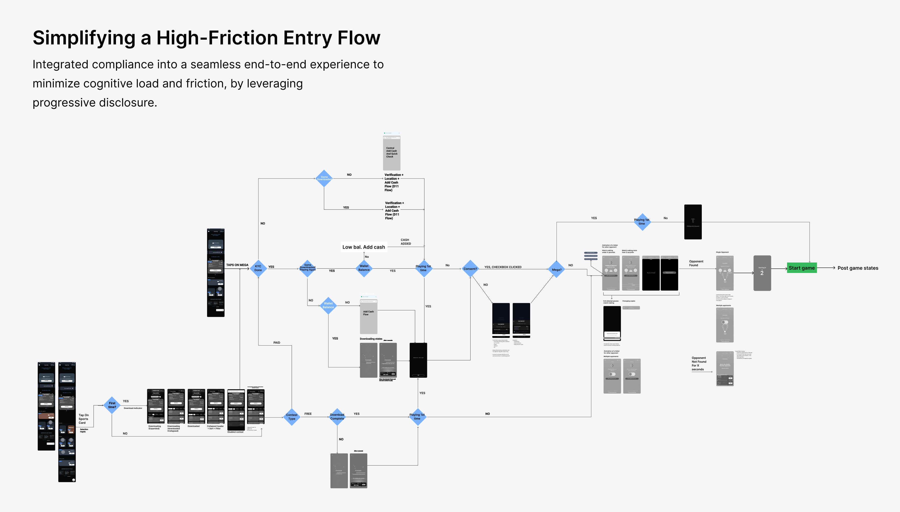
The entry flow, from login to first contest.
Built to Scale
A small app with many games.
Indian users drop off mid-download when an app is too large. So the app stayed light: one game shipped with it, the rest downloaded on demand.
Games on demand
Assets downloaded only when needed, so the first install stayed small.
Failure built in
In progress, taking longer, retry: every state designed, so a slow line never blocked the lobby.
Built for partner studios
Outside studios brought their own branding inside one consistent shell.
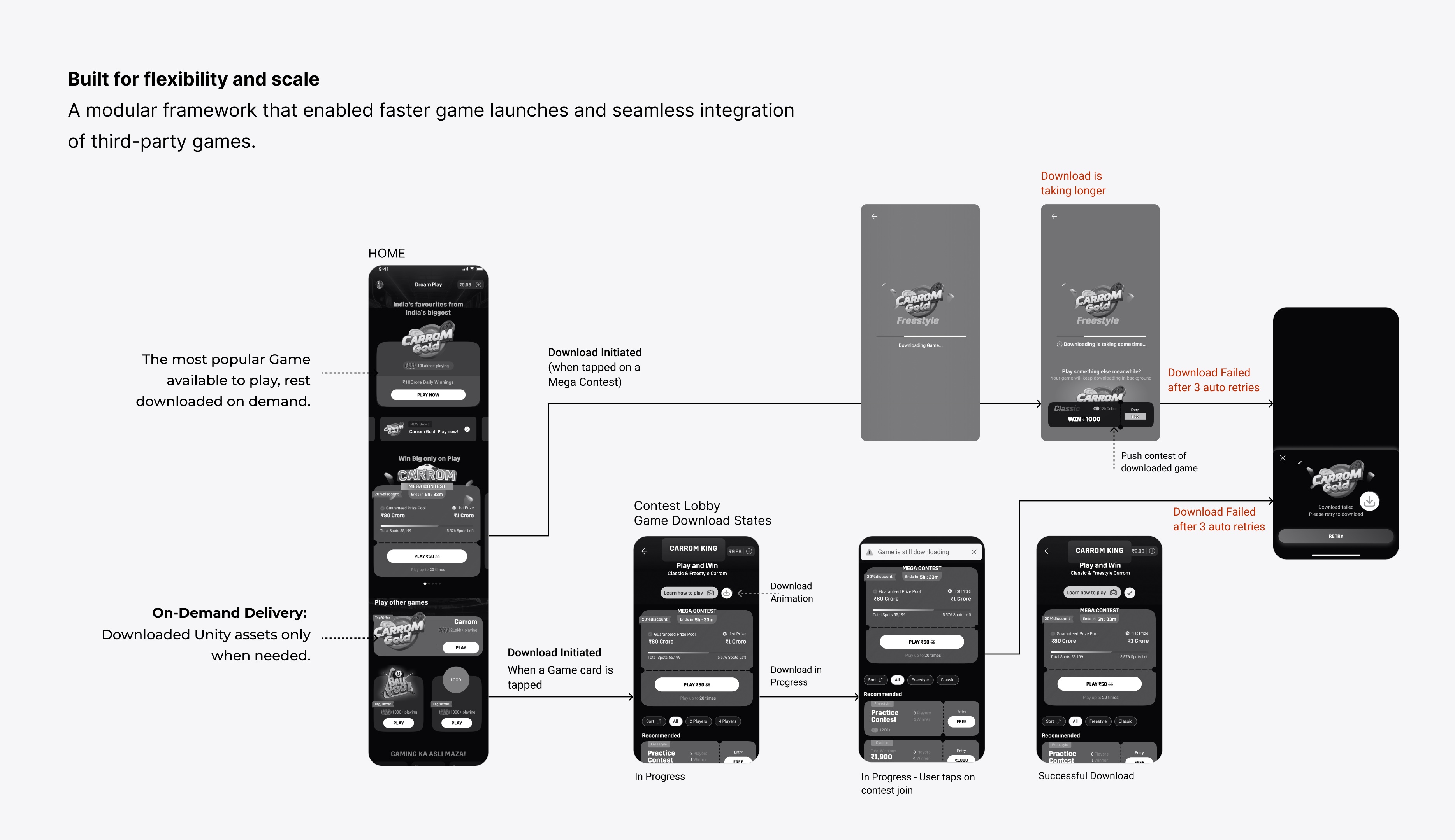
Download states, from in progress to retry.
Matchmaking
Keeping a ready player from dropping off.
A small wait or a dead end lost a ready player. Matchmaking fixed this with social proof, a fallback for every stall, and a next option instead of an apology.
Live players build trust
A live player count on every contest: the game was active, a match was moments away.
Filling the wait
Tips scrolled while matching, and the prize pool landed the moment an opponent was found.
No opponent found
Similar contests suggested, entry refunded in minutes.
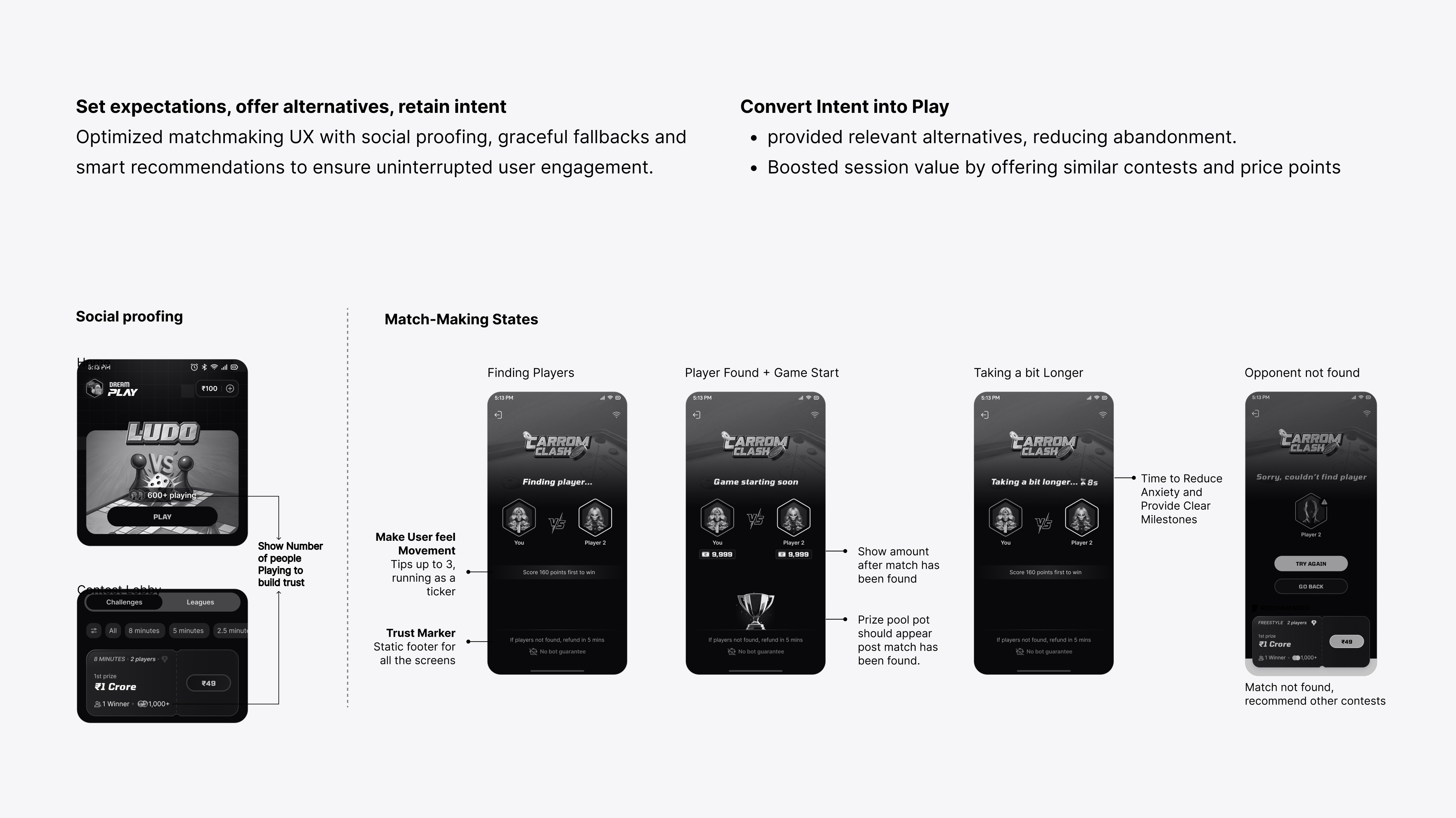
Matchmaking states, with social proof and a fallback when no opponent was found.
Mega contests first
The biggest prize pool led, because it pulled people in.
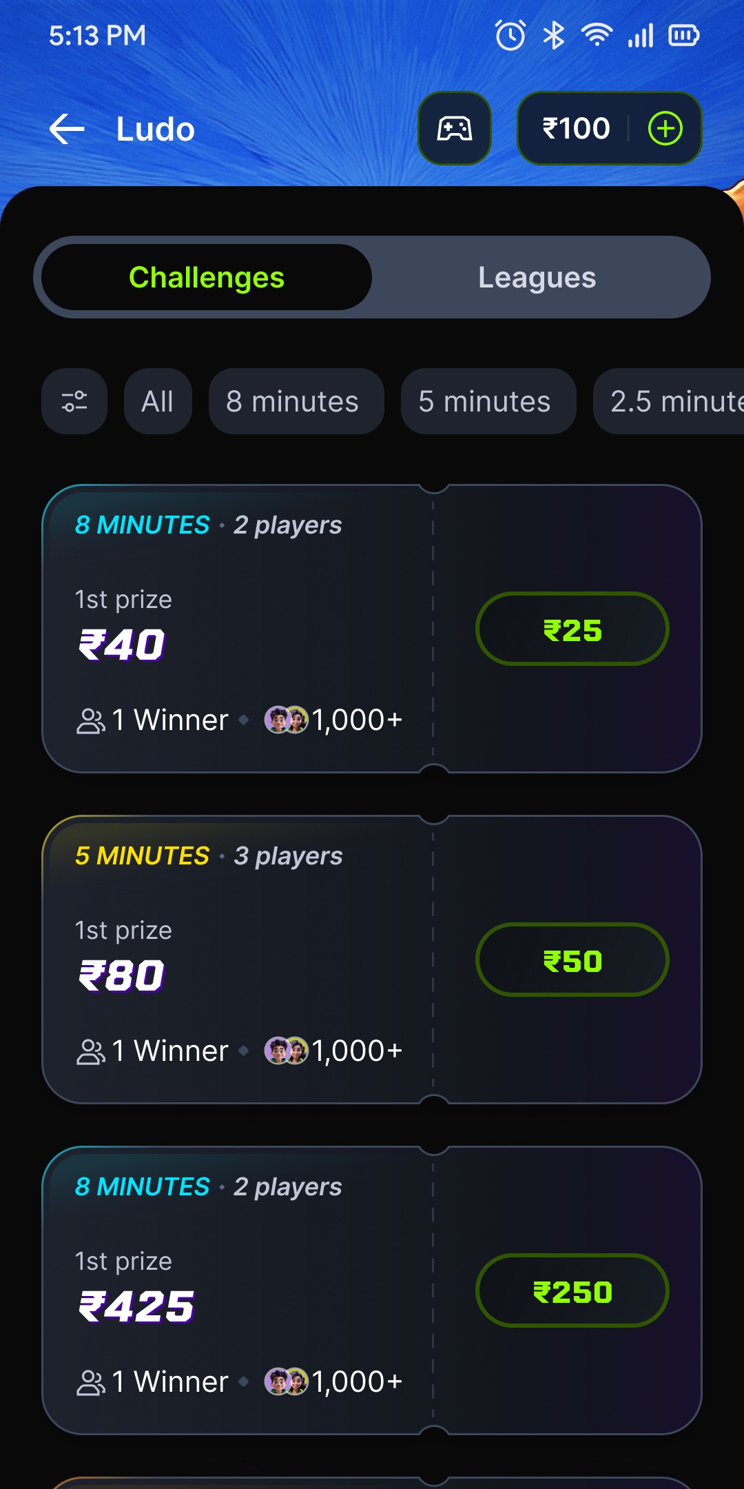
The contest lobby
Challenges matched 2 to 4 players by skill; Leagues ran for a window, highest score won.
Finding an opponent
Matchmaking ran, then the game started.
Fair Play and Recovery
Server-verified scoring and error recovery.
Two things had to hold: every score verified on the server, never trusted from the phone, and a clear recovery when something broke. An exit, a network drop and a server failure looked identical in the moment, so each got its own flow.
An animation buys server time
A dice roll or token move covered the time the server needed to verify the result.
Say what went wrong
Weak signal, no network, server issue: each message named the cause and the next step.
Give the money back cleanly
One minute to reconnect. If it failed, the entry was refunded.
Fair, time-capped turns
Every turn was time-capped. A missed move passed, so no one paid for someone else's lag.
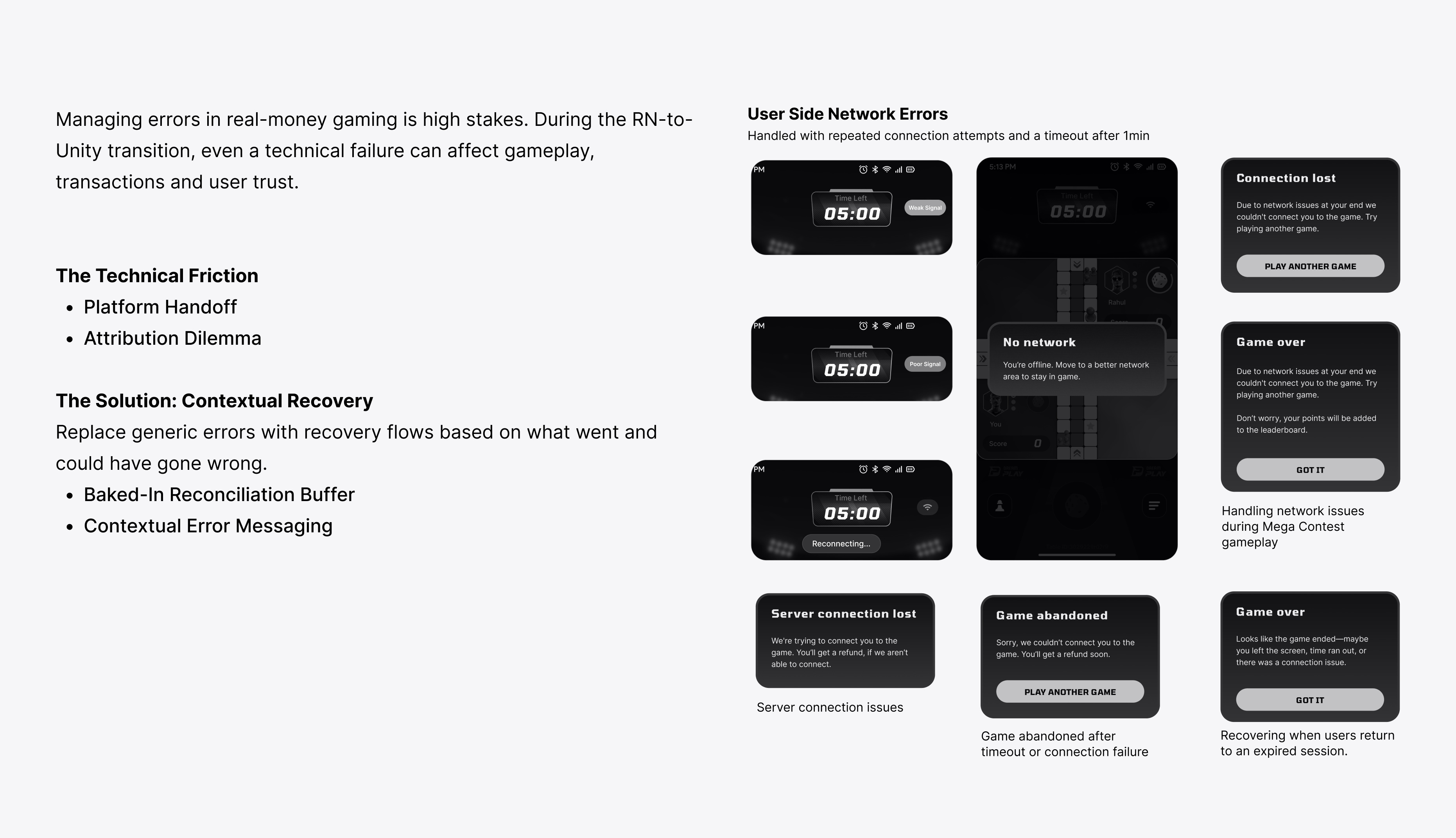
Every network error: repeated reconnects, then a one-minute timeout before a refund.
A missed turn
The turn passed. Nobody was penalised.
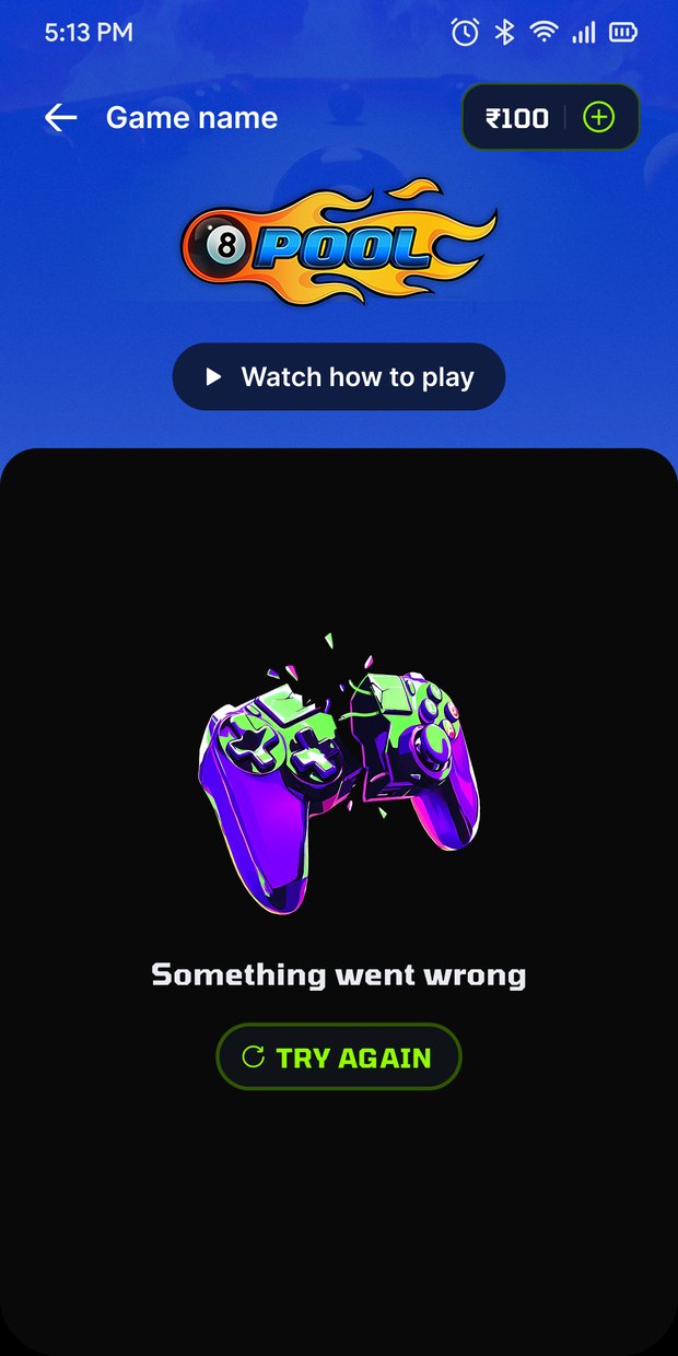
When something breaks
The message always named the next step.
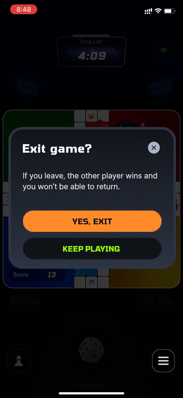
Leaving mid-game
Made a deliberate choice, never an accident.
Async scoring
In play-anytime contests, players finished at different times. The leaderboard showed which games were still running, then settled once every game was in.
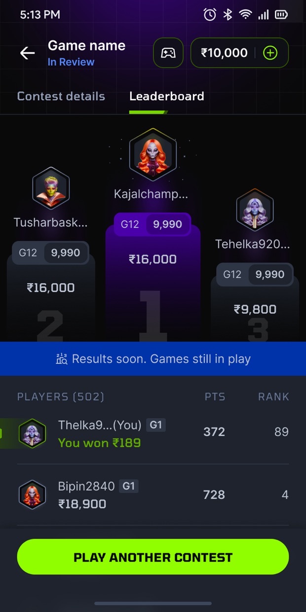
Scores still updating
Shown as pending, then settled.
Waiting on results
"Few games may be in progress," then the score-update note.
Error states and messaging
Every message named the situation and the next step: a refund, an update prompt, a nudge to come back. The tone stayed calm even when money was involved.
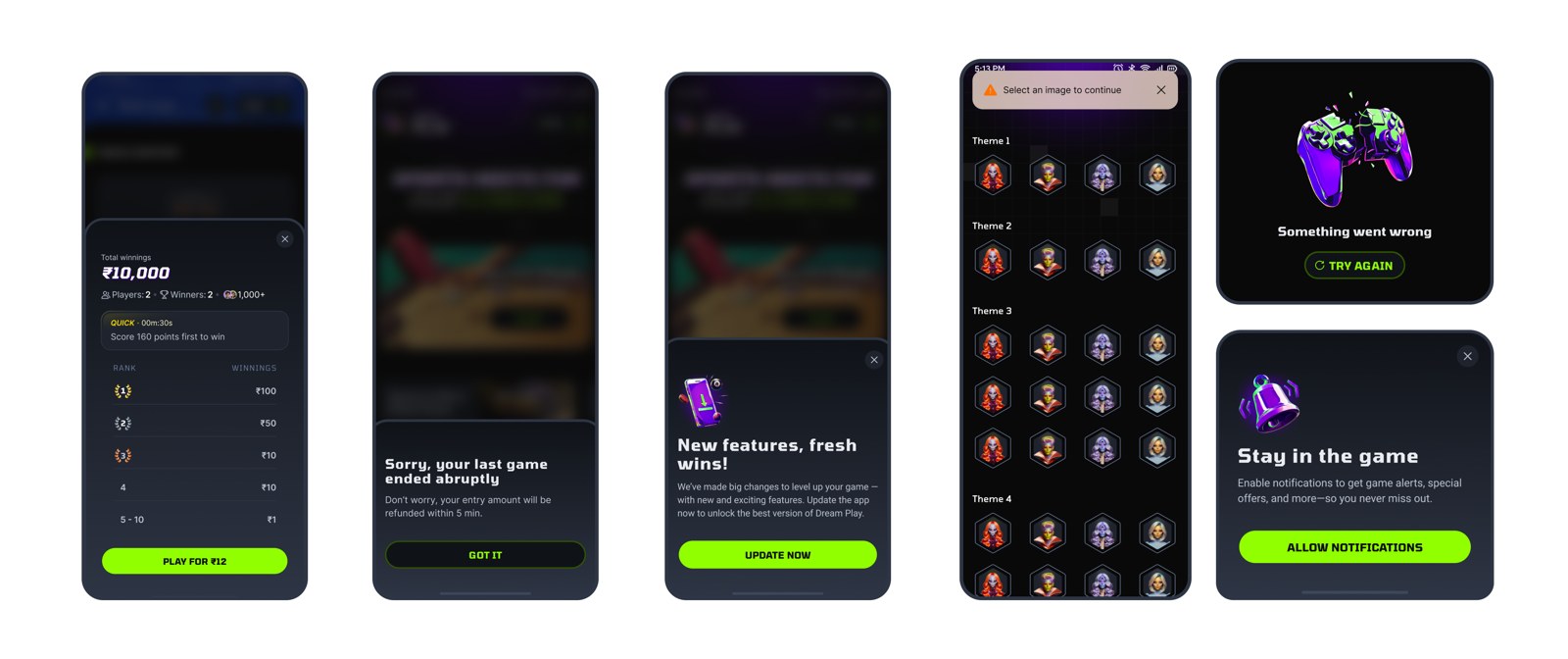
Refunds, updates, errors and nudges, each written to keep trust.
The Product
The screens that shipped.
Where the strategy showed up, from the first screen to a full game of Ludo.
Home & profile
The home was a gateway to every game mode: a widget-based layout built for conversion and reach. The profile kept wallet, stats and avatar together, so a player never had to leave the app to check where they stood.
- Mega Contests and trust markers surfaced first, to drive conversion
- Wallet and profile one tap away
- Widgets and Mega Contests pushed from the backend, so new ones reached players on demand, no app update needed
The widget home
Built around Mega Contests.
Profile and avatar
Wallet and stats in one place.
Contest lobby
Each lobby led into the game: big contests up top, then filters and sorting. The leaderboard itself was gated behind joining, so a contest that was live but unplayed showed a clear prompt instead of an empty list.
- Leagues: Stayed open for a set window; anyone could join and play anytime.
- Challenges: Matched two to four players instantly, by skill.
The lobby
Every contest for a game, in one list.
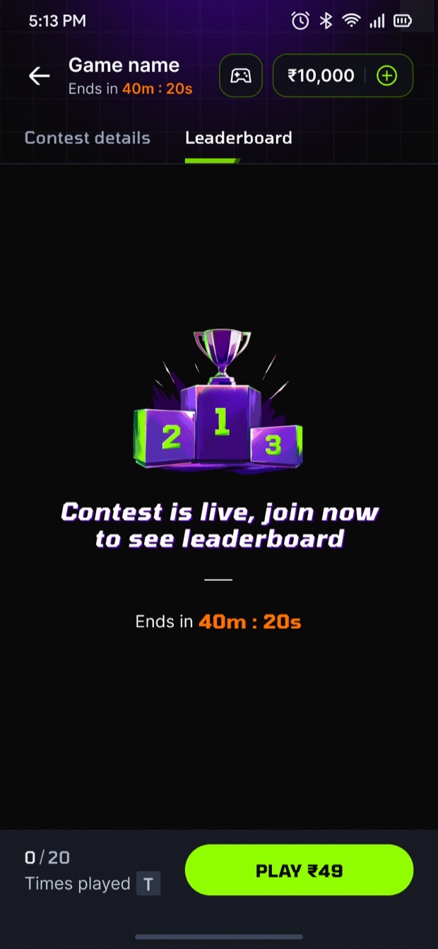
Before you join
"Join now to see leaderboard" instead of an empty board.
Ludo, up close
Ludo shipped in two-, three- and four-player boards.
- True-to-life gameplay: Authentic 2-, 3- and 4-player Ludo formats for instant familiarity.
- Rich sensory feedback: Haptics and sound amplified excitement and key moments.
- Fast, controlled pacing: Time-limited moves drove quicker game loops and reduced drop-offs.
- Always-in-motion UI: Purposeful animation sustained energy, action and momentum, while the board stayed in motion as the server checked each result.
Head to head
Two players, one board.
Three players
The same board, one more seat.
Scoring and states
How points and game states worked across every Ludo mode.
Winning, losing, playing again
Win or lose, the result screen set up the next game.
The win
Confetti, the champion reveal, the payout, then a nudge to play again.
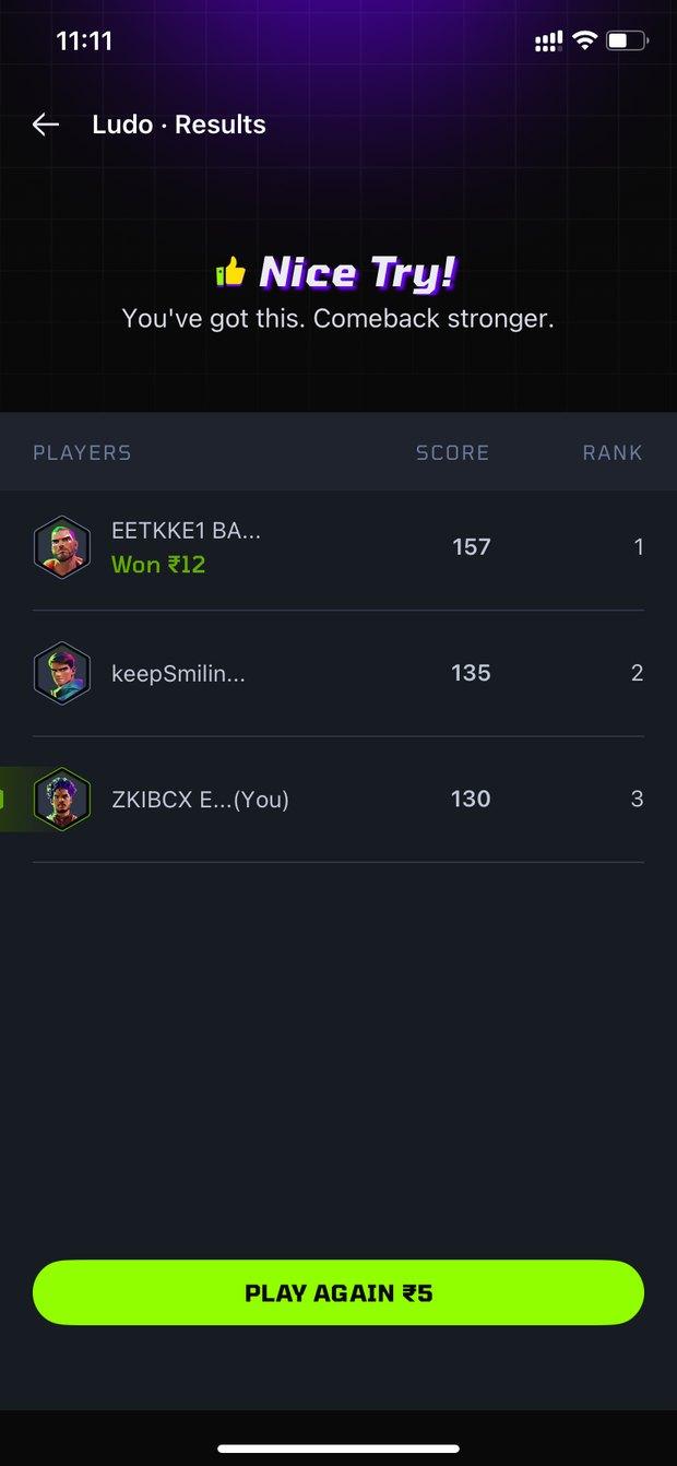
The loss
Points straight to another game.
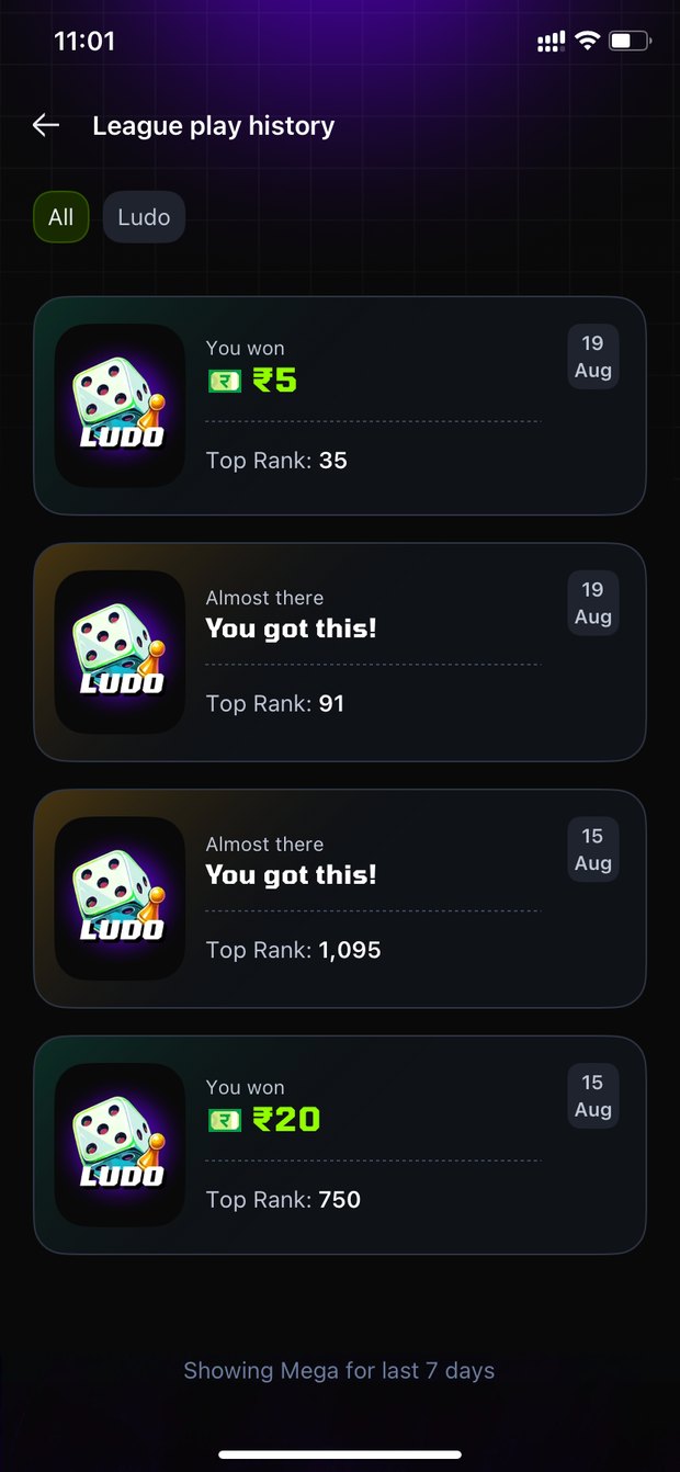
My contests
Every contest, rank and payout in one place.
The Look
A visual identity, built from scratch.
Nothing in the market looked right, so the system was built from scratch against the principles: readable, energetic, ready to grow.
Two lead colours, a deep electric indigo and a bright chartreuse, over a calm grey. Built to move: the intro set the tone before a contest loaded.
The brand in motion
The identity animated for launch.
Typography
Aa
Tomorrow
Titles and headlines. A bold display face that carried the energy of the brand.
Bold · Semibold · Medium · Regular
Aa
Inter
Body and interface. A plain, highly readable face for everything people read.
Bold · Semibold · Medium · Regular
Colour
Primary
Electric IndigoBrand
ChartreusePrimary
Payne's GrayNeutral
Accent
RISD BlueAccent
School Bus YellowAccent
PumpkinError
Pigment GreenSuccess
Illustration
Illustrations were crafted with one consistent visual language, combining electric gaming elements with real-world symbolism to keep them meaningful and engaging: a trophy, a friendly error, an empty history. They helped inject life and personality into the product.
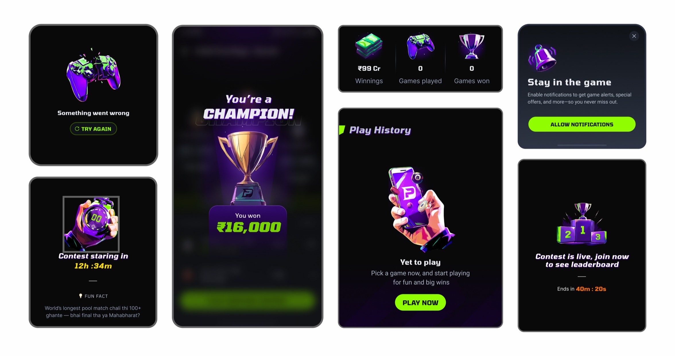
One language across errors, wins, stats and empty states.
Game identity
A modular identity and asset system. Assets updated from the backend, so a player downloaded only the games they played.
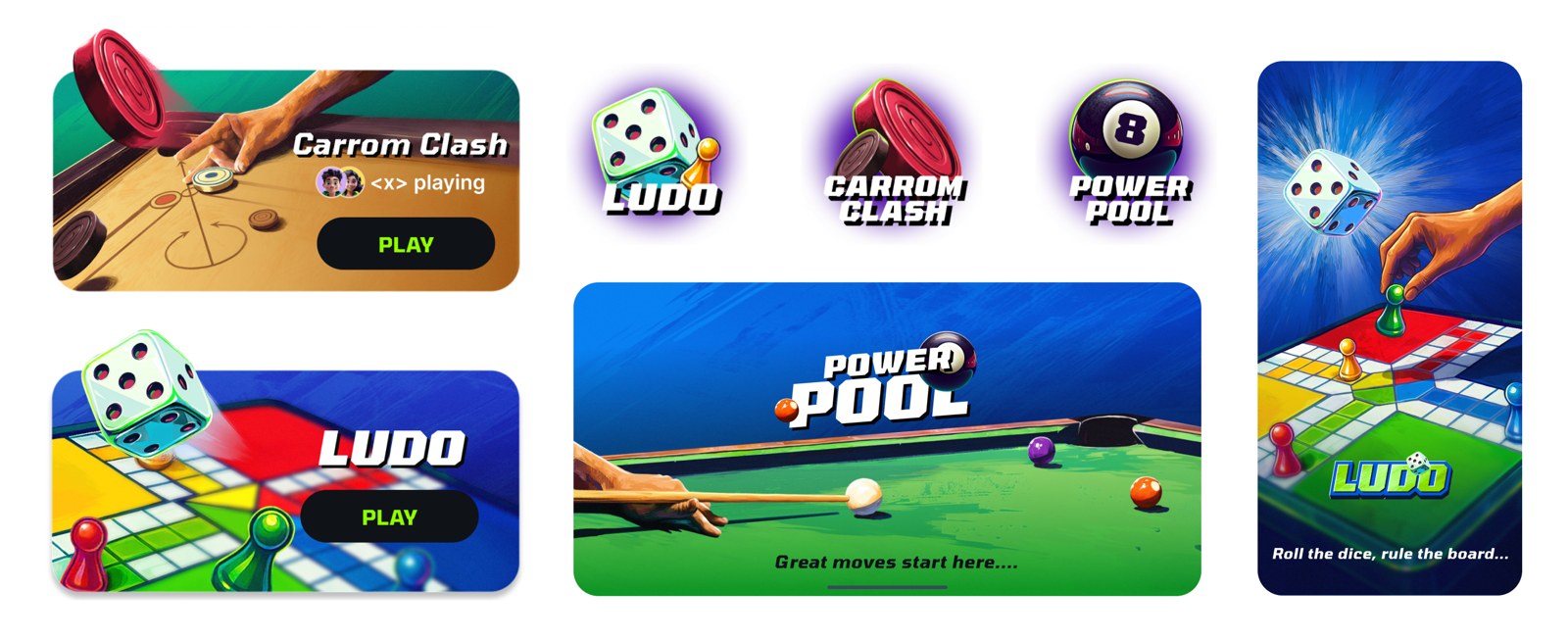
Logos, cards and key art per game, one shared shell.
Communication design
The same identity ran through promotions, Dream11 cross-promotion and scratch cards, the low-cost channels that brought players in.
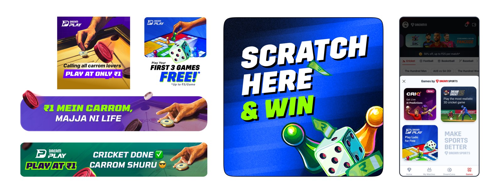
Banners, offers, scratch cards and cross-promotion, one voice.
The Milestones
Eleven months, kickoff to pause.
Two games, seven formats, and a crore of daily CEA, before new gaming rules stopped it.
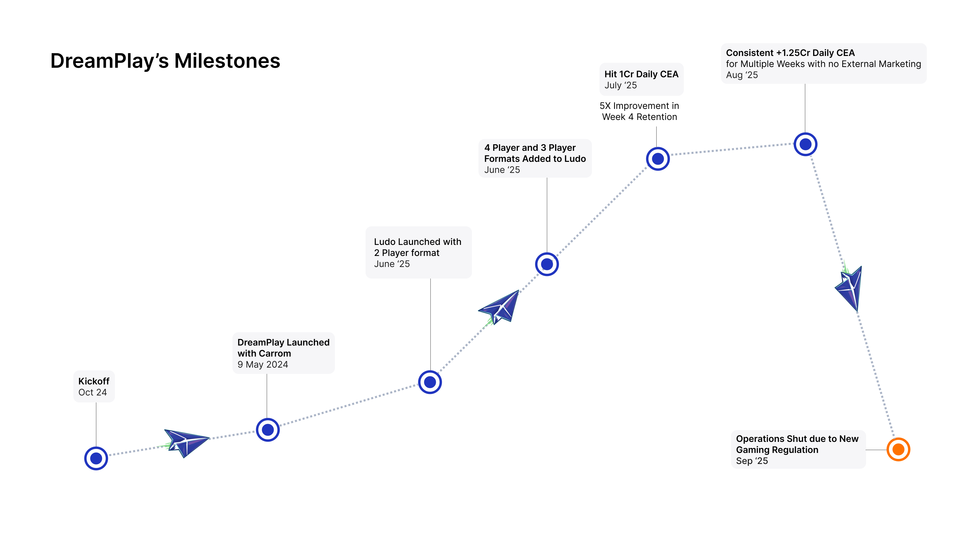
Kickoff to pause, in eleven months.
Explore other projects
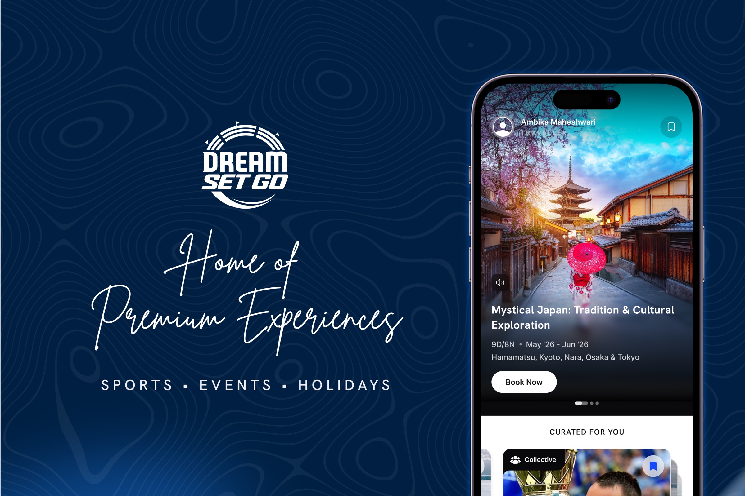
DreamSetGo
An app and a website for premium sports hospitality, events and travel, built as a new online vertical inside an offline business.

Scout AI Travel Assistant
An AI travel assistant for DreamSetGo, helping users discover and plan premium experiences across Sports, Events and Travel.
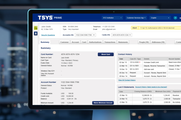
TSYS Prime
A CRM redesign for TSYS, one of the world's largest platforms for banks and credit card companies for managing the credit card ecosystem.
Social Gameplay
A social ecosystem spanning Feed, Chat, Challenges and Network Tracking, built across five years on India's largest fantasy platform.