TSYS processes ~40% of North American card transactions, with Prime used by customer service agents across banks and financial institutions.
Enterprise CRM Redesign
TSYS
Prime
A ground-up redesign of a legacy CRM used by customer service agents at banks and financial institutions worldwide.
~40%
of North American card transactions processed by TSYS
14 mo
research-led engagement, from discovery to handoff
3
geographies covered in contextual research
80%
of agent queries resolved from the Summary screen
This project has been simplified to respect NDA and confidentiality requirements.
The Situation
A product shaped by legacy, not users.
Over time, the platform had accumulated significant design debt:
- Inconsistent controls and interaction patterns
- Technical codes that were difficult to understand
- Navigation built around system entities, not agent tasks
- No consistent visual or interaction system
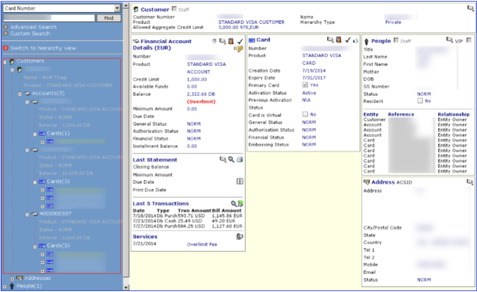
The legacy interface was dense and organised around the database, not the call.
The Problem
What the business needed.
What agents were dealing with.
The brief had two sides: business goals and the problems agents faced on every call. Research made both clear.
Business Objectives
- Design around agent tasks, not system structure
- Create a consistent, accessible design system
- Surface relevant information faster
- Support client configuration without losing consistency
Pain Points from Research
- Critical information was scattered across tabs
- Internal codes were difficult to understand
- Navigation often broke context
- Flat data grids made scanning difficult
- Critical actions took the same steps as routine ones
- Weak hierarchy made priorities hard to spot
The Approach
Research-led across three geographies.
Validated at every step.
A 14-month engagement spanning contextual research, IA, interaction and visual design, with usability testing at every major milestone.
01
Stakeholder workshops
Aligned business goals, technical constraints and client needs early
02
Global contextual inquiry
Observed agents handling real calls to understand tasks, decisions and cognitive load
03
Scenario-based task analysis
Mapped agent mental models against the existing IA to find where system logic broke down
04
IA & interaction redesign
Rebuilt the structure around task frequency and decision context, not entity hierarchy
05
Remote usability testing
Tested each milestone with real agents and iterated before moving forward
06
Visual style guide authorship
Documented the system across colour, type, spacing, components and states for engineering handoff
The Insight
What agents actually did.
What the system was built around.
The biggest gap was simple: agents thought about the caller's problem, while the system thought about its data.
The old architecture reflected the database, not the conversation happening on a phone call.
BEFORE
System architecture
- Customer → Account → Card → Authorizations → Transactions
- Each entity lived on a separate page
- Internal codes required memorisation or lookup
- Actions were tied to individual entities
- Navigation often broke context
- Flat hierarchy made priorities hard to see
AGENT REALITY
How agents actually worked
- Agents thought in terms of the caller's problem
- 80% of queries could be resolved from Summary
- Clear labels mattered more than internal codes
- Actions needed to appear in context
- Context had to persist across navigation
- Alerts needed strong visual priority
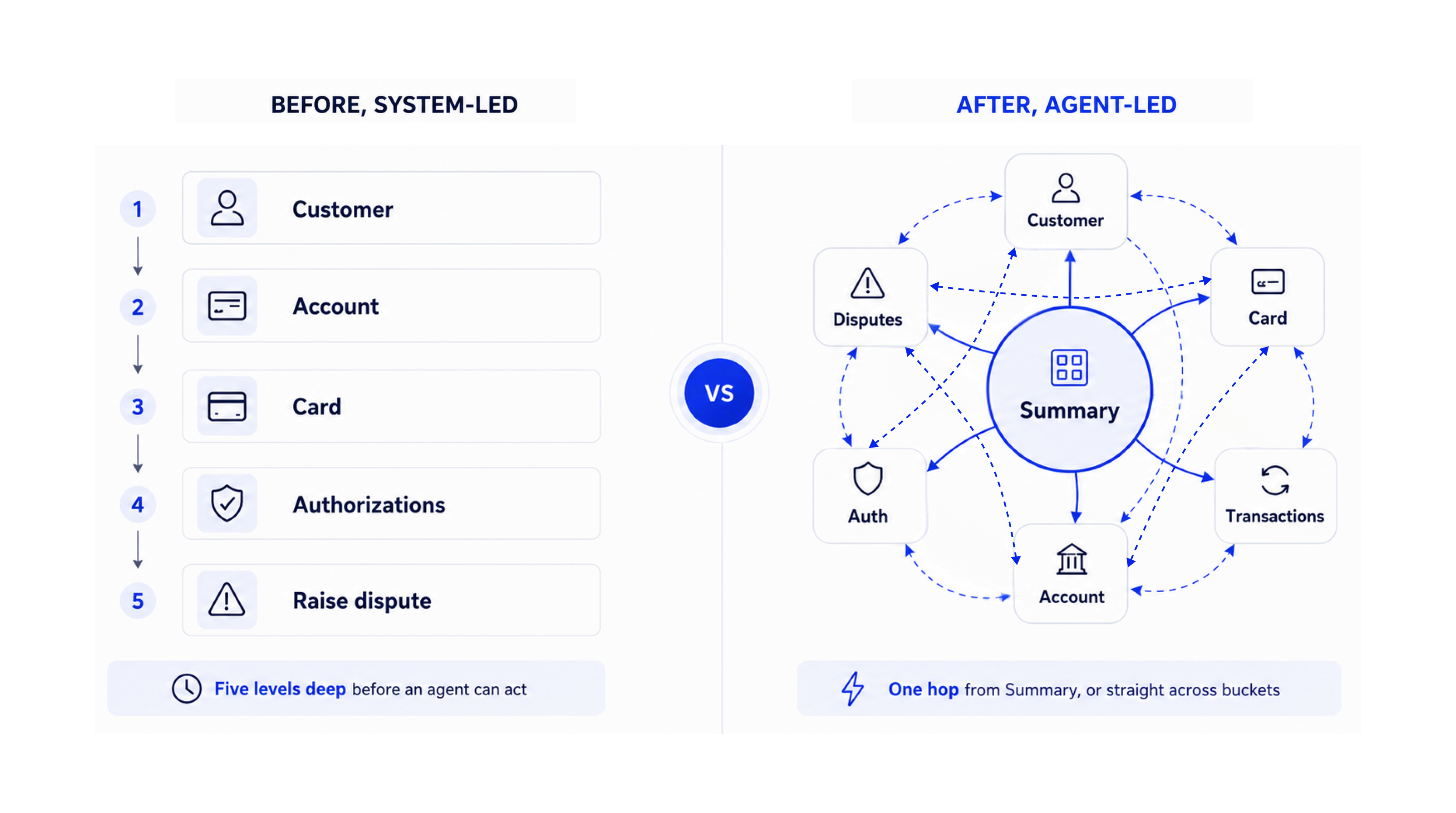
From a five-level system hierarchy to a one-hop agent hub.
The System
One structure, every screen.
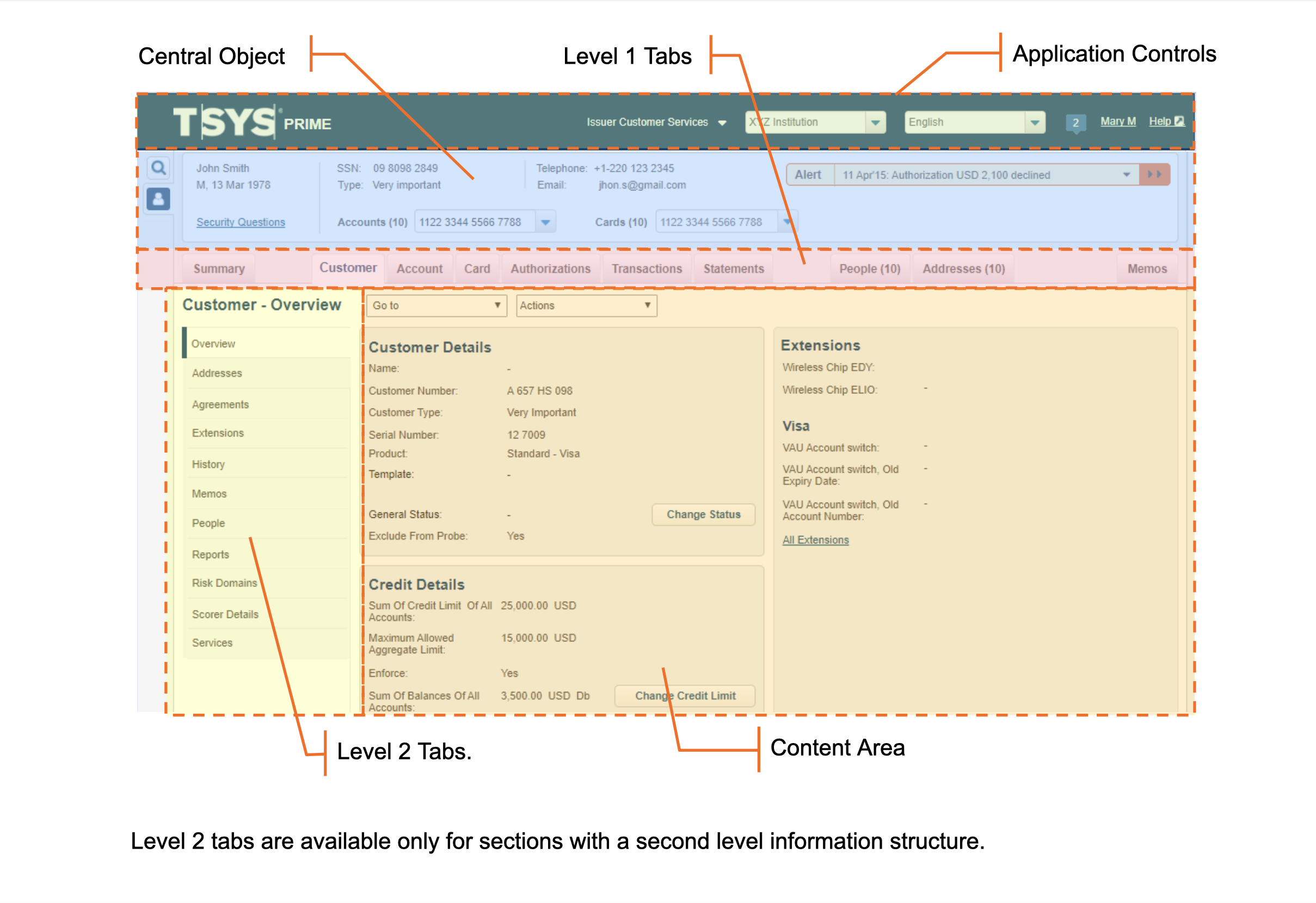
We tested multiple layouts against real agent tasks until a four-zone structure consistently worked. It became the foundation for Prime, creating predictable navigation across the system.
- Application Controls, always-visible global controls
- Central Object, the customer, account or card in focus
- L1 Tabs, primary section navigation
- Content Area, main content with L2 navigation when needed
5.1
One layout, every screen
Page structure, zones & components
Every screen followed the same four-zone structure: Application Controls, Central Object, L1 navigation and Content Area. L2 tabs provided deeper navigation where needed.
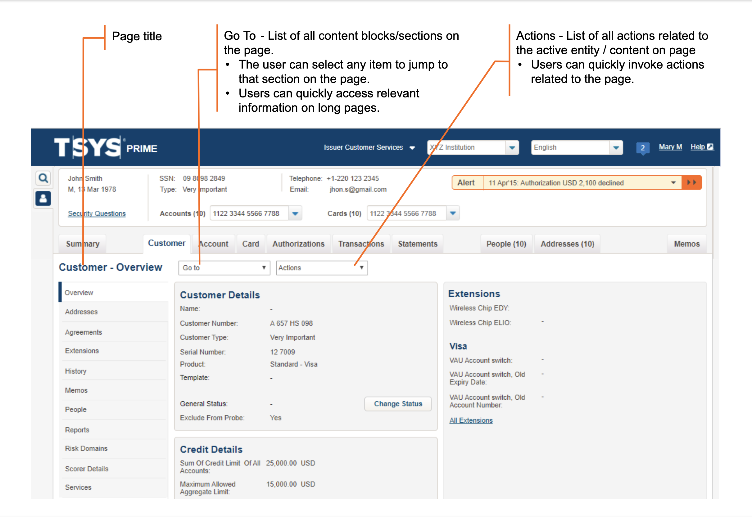
An L1 tab in context: the Customer screen.
Every L1 tab used the same structure: page title, Go To navigation and relevant actions.
5.2
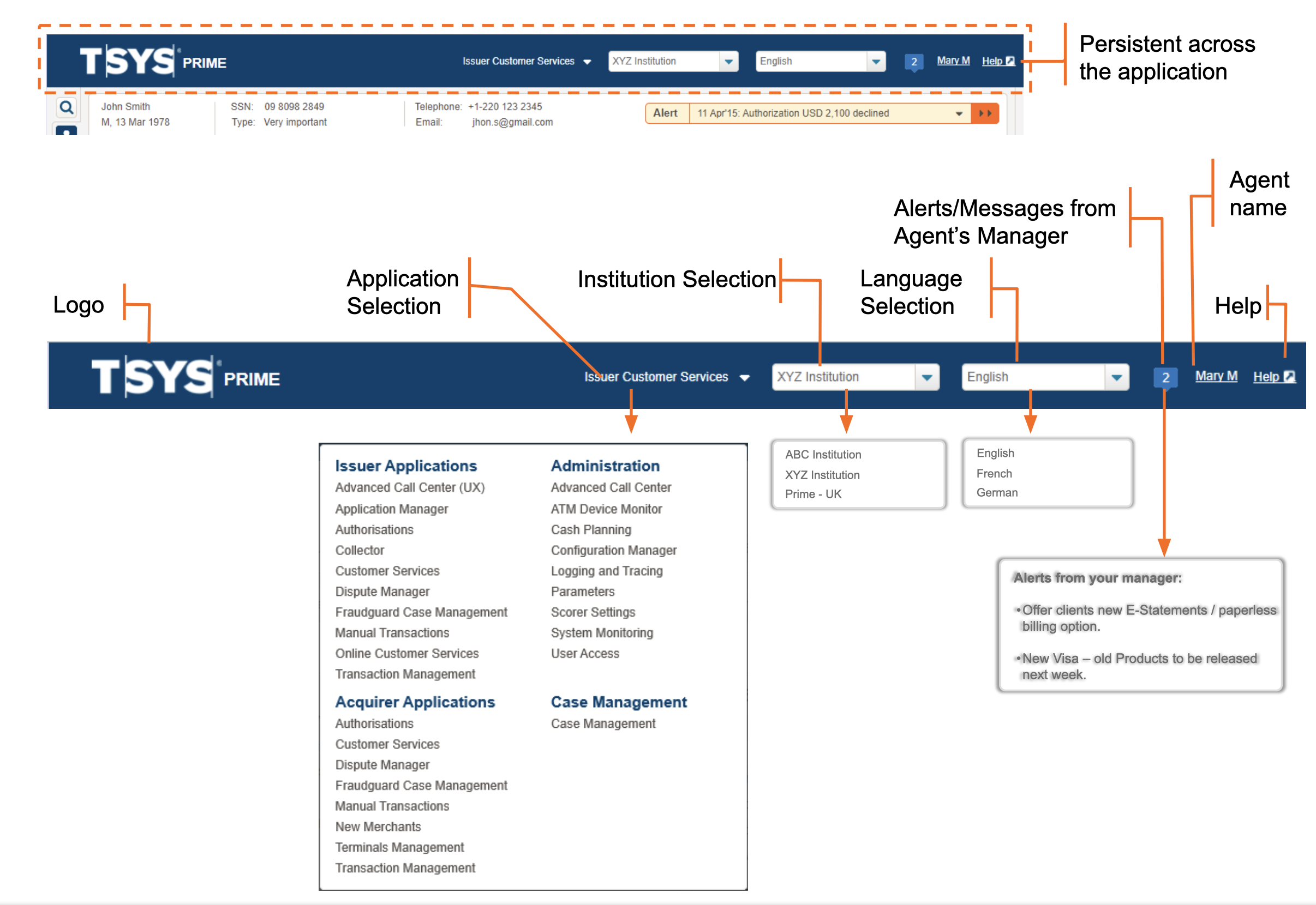
A persistent global header
The Application Controls bar stayed fixed across every screen, giving agents a consistent anchor throughout each session. It housed:
- TSYS logo and Prime version
- Institution and language selectors
- Application switcher
- Agent name and logout
Application Controls, persistent header anatomy
Agents could switch institutions, move between TSYS products and access their account without leaving the current context.
5.3
80% of queries resolved here
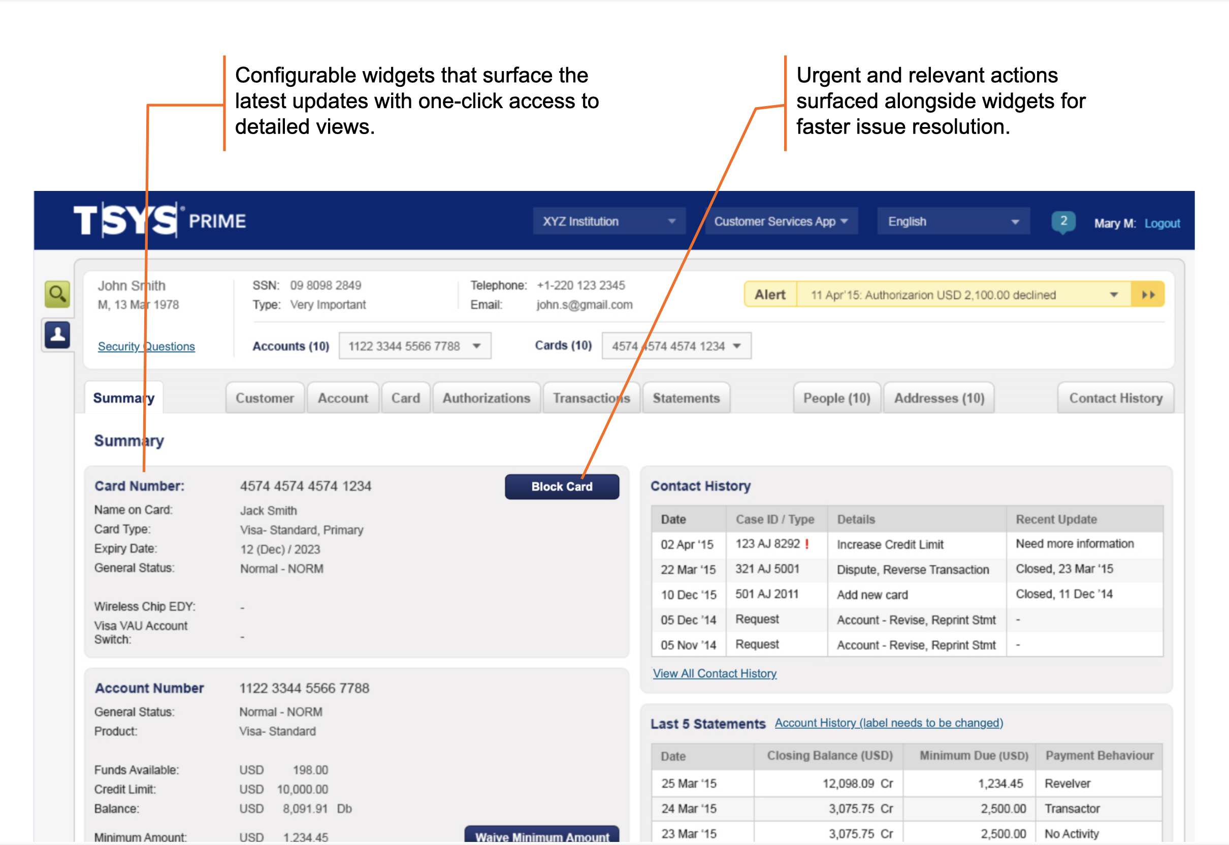
Summary brought the information agents needed most into one view: Card Details, Contact History, Last 5 Statements and Services.
- 10 rows gave agents the right depth for quick scanning
- Configurable widgets surfaced recent activity
- Relevant actions appeared alongside the information needed to act
- Longer lists opened through View all
The Summary was built for fast resolution, not exhaustive data.
Summary screen, widgets and quick actions
Latest activity and urgent actions, surfaced where agents need them.
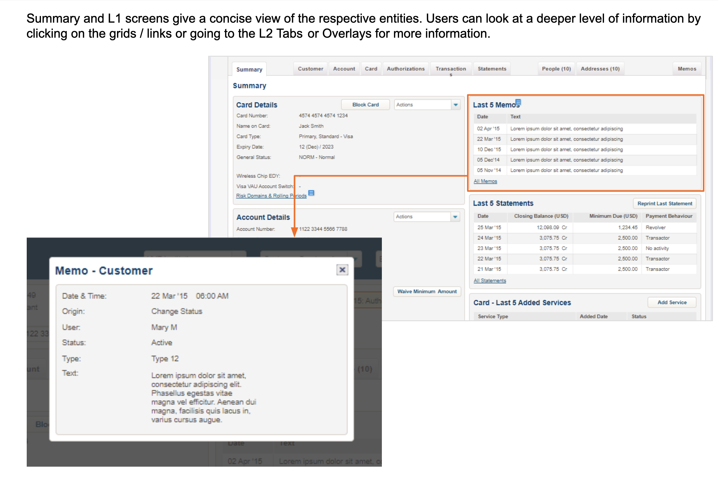
Concise by default. Depth on demand.
Agents could open deeper details through links, grids, L2 tabs or overlays without losing their place.
5.4
Context stays visible
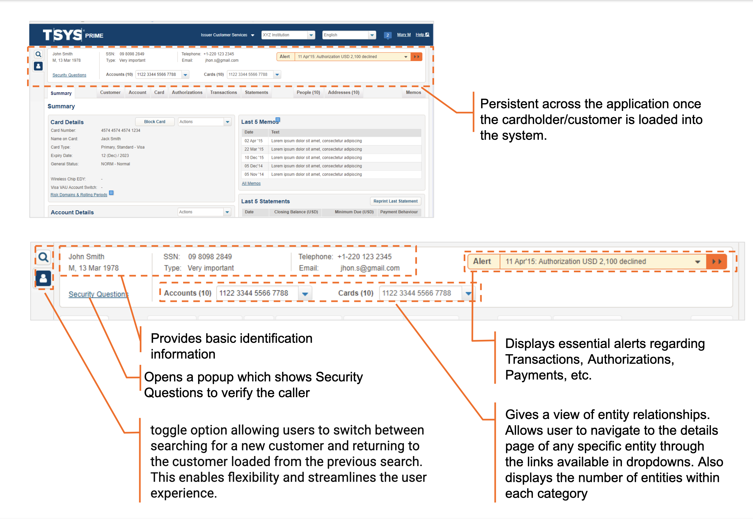
The Central Object kept the active customer, account or card visible across screens. It also:
- Showed related records at a glance
- Surfaced alerts and items needing attention
- Linked directly to related entities
Agents kept context without returning to search.
Central Object, annotated
Identity, relationships, alerts and key actions, always in context.
5.5
Find the right customer
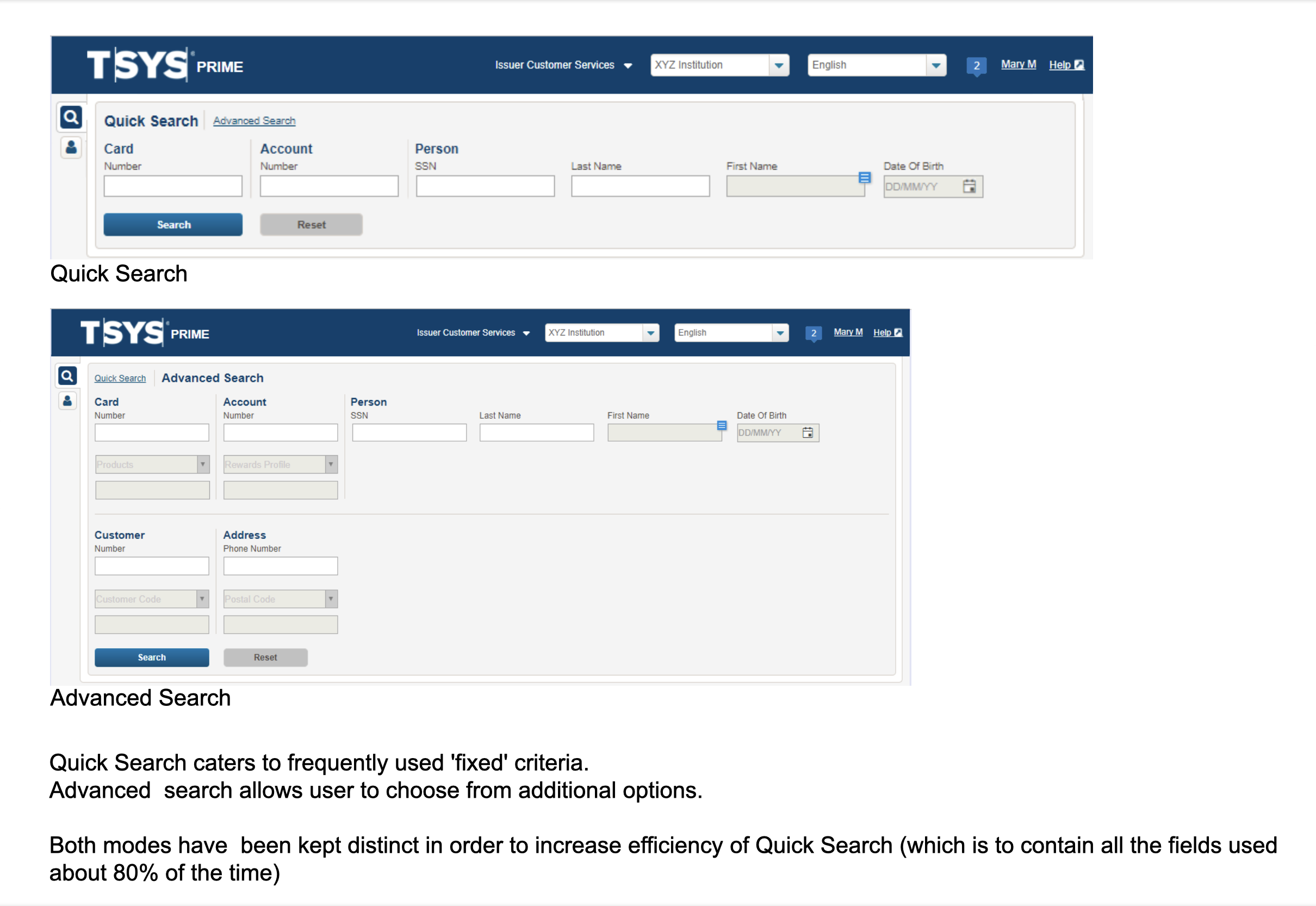
Search was designed around how agents identify customers, with quick access to common details and deeper options for more complex cases.
- Quick Search: Common fields such as card number, account number, SSN, name and DOB.
- Advanced Search: Additional fields grouped by Card, Account and Person for more specific lookups.
Quick and Advanced Search, designed for different lookup needs.
Quick Search surfaced the fields agents used most. Advanced Search exposed the full set when deeper lookup was needed. Both used the same result pattern.
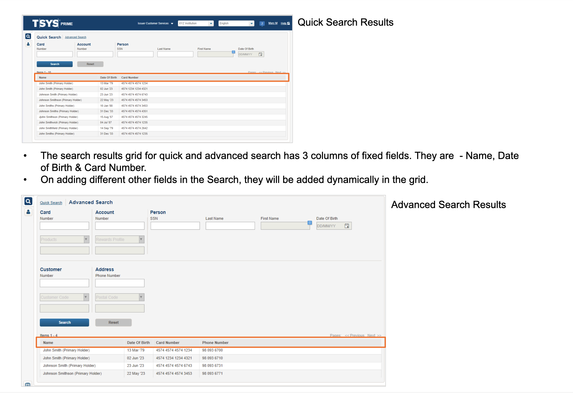
Results stay relevant to the search context.
Quick Search used three fixed columns: Name, Date of Birth and Card Number. Advanced Search adapted columns to the fields used in the query.
The Prototype
The system, in your hands.
View the high-fidelity prototype used for remote usability testing with agents.
- Account lookup
- Transaction investigation
- Dispute initiation
- Block-card flow
The Style Guide
A complete visual system.
The primary engineering handoff.
The Visual Style Guide became the single source of truth for engineering and future design work. It documented the system from design tokens and typography to component states and error handling.
7.1
Visual design principles
≤5 colour disciplineLimited each screen to five colours, using contrast only where it mattered: alerts, errors and key actions.
Consistent, neutral tonesA calm palette reduced visual fatigue across long shifts while keeping the interface efficient.
Clear associations, no clutterStrong grouping, hierarchy and feedback helped agents scan faster and focus on what mattered.
7.2
Colour tokens
Primary Blue
Button Primary
Error Red
Neutral Text
Stroke
Background
Grid Selected
7.3
Typography: Arial system font
Account, Overview
Card Details
Last 5 Transactions
Account Number
Body Content
Explore other projects
DreamSetGo
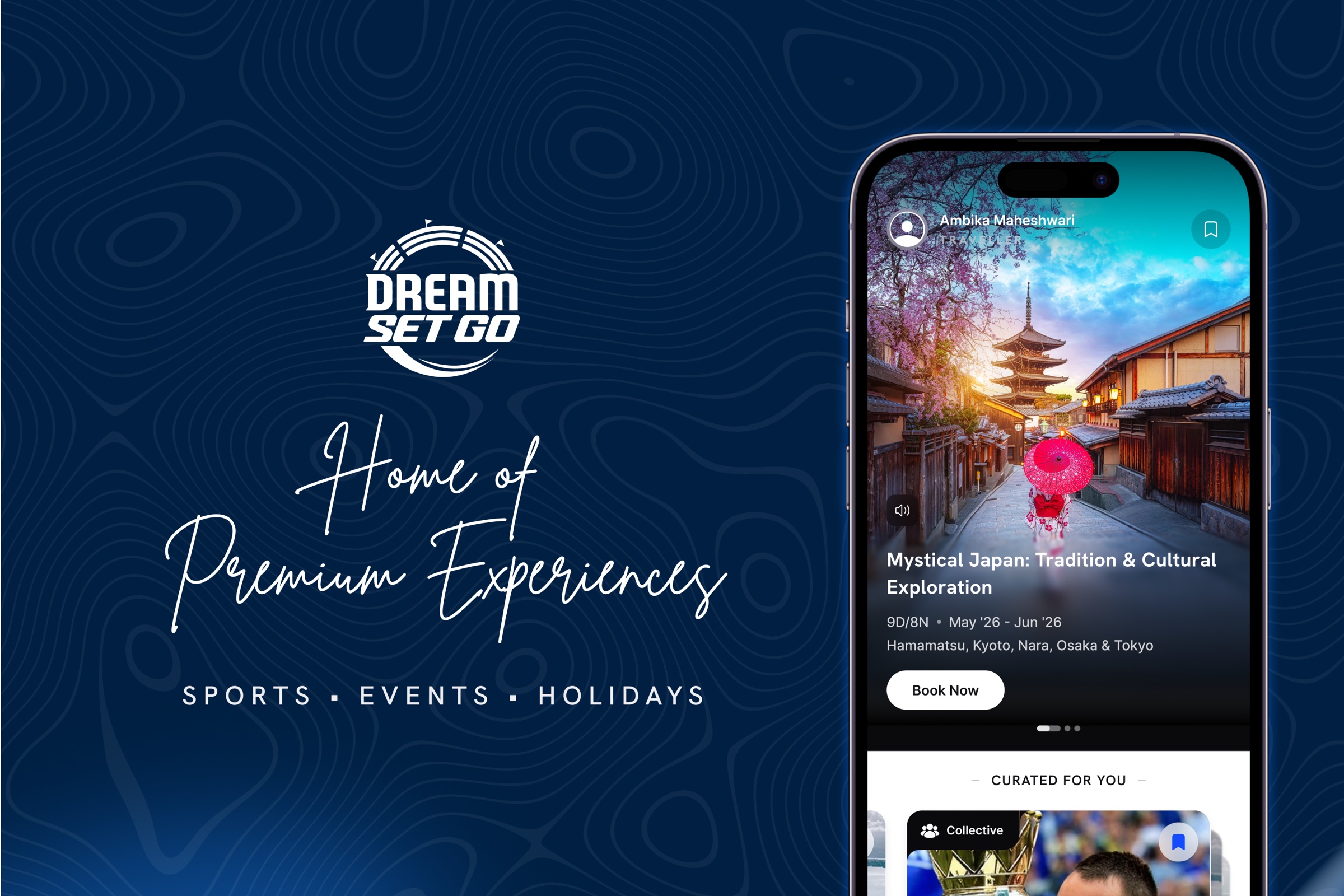
An app and a website for premium sports hospitality, events and travel, built as a new online vertical inside an offline business.

DreamPlay
A casual gaming app, built on a modular platform and establishing a distinct visual DNA for gaming fans.
Scout AI Travel Assistant
An AI travel assistant for DreamSetGo, helping users discover and plan premium experiences across Sports, Events and Travel.
Social Gameplay
A social ecosystem spanning Feed, Chat, Challenges and Network Tracking, built across five years on India's largest fantasy platform.